| Physics 202 |
Intro to Astronomy: Lecture #17
|
Prof. Dale E. Gary
NJIT
|
H-R Diagram for Stars
A Most Important Diagram
Classifying stars
according to their spectrum is a very powerful way to begin to understand
how they work. As we said last time, the spectral sequence O, B,
A, F, G, K, M is a temperature sequence, with the hottest stars being of
type O (surface temperatures 30,000-40,000 K), and the coolest stars being
of type M (surface temperatures around 3,000 K). Because hot stars
are blue, and cool stars are red, the temperature
sequence is also a color sequence. It is sometimes helpful,
though, to classify objects according to two different properties.
Let's say we try to classify stars according to their apparent brightness,
also. We could make a plot with color on one axis, and apparent brightness
on the other axis, like this:
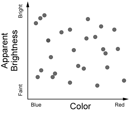
Figure 1: H-R Diagram of apparent brightness versus star color (or
temperature). You can see that this
classification scheme is not helpful -- the stars are randomly scattered
on the plot.
Obviously, plotting apparent
brightness against color is not helpful, because there are no patterns
in the placement of the dots representing stars. They are scattered
around randomly. This is because the stars
are at all different distances, so the nearby ones appear bright
even though they may be intrinsically not so bright.
But what if we look at this
same plot, but somehow make sure that the stars are all at the same distance.
You know that stars sometimes appear in clusters (because they were all
formed out of the same giant cloud, parts of which collapsed to form a
lot of stars all around the same time). Here is a photograph of the
Pleiades star cluster:
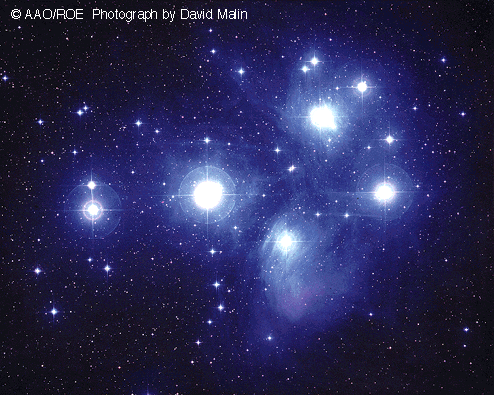
Figure 2.
If we plot the apparent brightness
versus color for such a cluster, where all the stars are the same distance,
you get a plot like this:
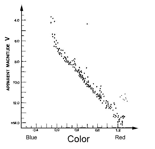
Figure 3.
Now you can see that the
points representing the stars fall along a clear line in the plot.
Such a plot was first made by two astronomers working independently: Ejnar
Hertzsprung (Denmark) and Henry Norris Russell (Princeton, USA).
This kind of diagram was named after them, as the Hertzsprung-Russell
Diagram, or H-R Diagram.
It is an extremely powerful diagram for classifying stars and understanding
how stars work. We are going to spend the rest of this lecture looking
in detail at this diagram. First, though, note the relationship between
apparent brightness and absolute brightness that we talked about last time.
We said that astronomers use absolute brightness, which is the apparent
brightness stars would have if they were all at the same distance of 10
parsecs. The diagram above uses apparent brightness (apparent magnitudes),
but for stars all at the same distance (the distance to the Pleiades star
cluster), so it is really a plot of absolute brightness versus color.
Or we could plot luminosity versus color, as below:
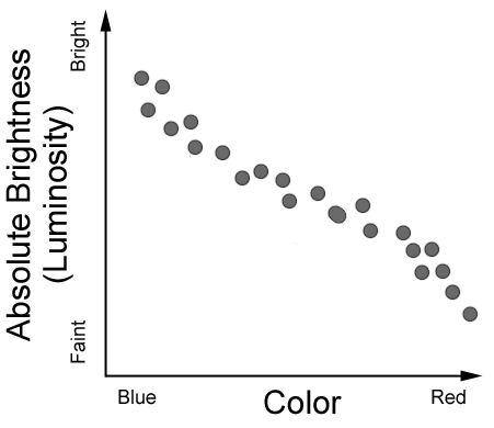
Figure 4. When we know the distances to stars, we can determine their
absolute brightness, or luminosity.
When we then plot luminosity (or absolute brightness) versus color
(or temperature), the stars all
fall along a narrow strip in the diagram. This is the H-R Diagram.
So the right way to think
about an H-R Diagram. It is telling us that a star's color (or temperature)
and its luminosity are related. Blue stars are more luminous than
red stars. To find this out, though, we
have to know the distances to the stars. Remember the
star catalog we showed one page of in the last lecture, from the Nearby
Stars catalog. We know the distances to these stars, by measuring
their parallax. Here is the H-R diagram for that catalog:
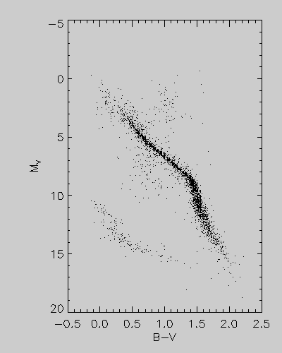
Figure 5.
Now we see that there is
a new region in the lower left, which correspond to faint-blue stars.
If blue stars are so luminous, why are these so faint? These are
faint because they are very small! They are a class of stars called
White
Dwarf stars. We can also look at the H-R diagram for other
clusters. Here is one for an old cluster of stars, M3, which is a
globular cluster:
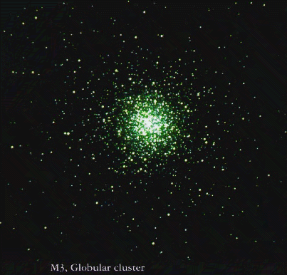 Figure 6 a.
 |
 Figure 6 b.
 |
Now we see a new
region of luminous red stars in the upper-right! If red stars are
fainter than blue stars, why are these red stars so luminous? It
is because they are giant stars, like the star Betelgeuse, which I mentioned
last time is so large that, if it were at the distance of the Sun, it would
engulf the Earth's orbit, and even the orbit of Mars. These are the
Red
Giant stars.
Patterns in the H-R Diagram
We see that the
H-R diagram can help us classify different kinds of stars, according to
the pattern of where the stars fall in the diagram. The diagonal
line that we saw for the Pleiades star cluster represents what we would call normal
stars. The White Dwarfs and Red Giants are different classes of stars
that the H-R diagram helps us to identify. So the H-R diagram can
tell us something about the size (radius) of the stars. The fact
that the H-R diagrams for the nearby stars, the Pleiades star cluster,
and the M3 star cluster are all different leads us to look for other differences
in these groups of stars that might explain it. It turns out that
the difference is the age of the stars.
The H-R diagram is going to help us learn something about how stars change
as they get older. So you can already see that this is a very powerful
diagram indeed.
Let's take a look at the
overall H-R diagram, including all the different types of stars that we
know of.
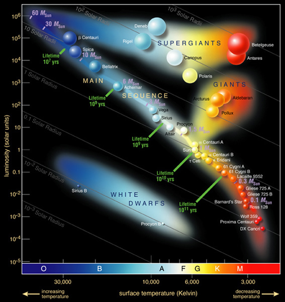
Figure 7.
The horizontal axis again
shows the color of the stars, and the vertical axis shows the luminosity,
in units of the solar luminosity. Note that the tick marks on this
vertical, luminosity axis are a factor of 10 apart! A factor of 10
is called an order of magnitude.
So the range of luminosity from bottom to top in this diagram is enormous.
Each star in the sky can be placed in a unique place on this diagram.
For example, the Sun is a yellow star of 1 solar luminosity (by definition!),
so you can find it near the center of the diagram. It falls on the
"normal star" line running diagonally from the lower right to the upper
left. This is called the Main Sequence.
Most stars fall along this line.
Radius:
Remember that last lecture
we said that if we know the temperature and distance to a star we can determine
its size. As it turns out, the red stars on the Main Sequence are
smaller than the Sun, and the stars get bigger as you go along the Main
Sequence toward the hotter (bluer) end. Stars on the Main Sequence
that are hotter than the Sun are also larger than the Sun. So hot
blue stars are more luminous (and therefore appear higher in this diagram)
for two reasons: they are hotter, and hot objects are more luminous than
cool objects, but they are also larger. In fact, if a hot star were
to get cooler without changing its radius, its luminosity would drop and
its color would become more red so that it would follow the diagonal lines
in the above diagram. Notice that the White Dwarfs, in the lower
left part of the diagram, are parallel with these constant radius lines.
From this we might expect that White Dwarfs get cooler, but stay the same
size, as they get older, and we would be right! Other stars also
get hotter or cooler during their lifetimes, but they also change size
at the same time, so they do not follow these lines.
The Red Giant and
Red Supergiant parts of the diagram show that these stars are 30 to several
hundred times larger in radius than the Sun. We will learn next time
that such stars are old, and that the Sun, as it nears the end of its lifetime,
will also swell up and become a red giant star.
Lifetimes:
Notice that there are time
markers along the Main Sequence. These are the lifetimes of the stars
that are found there. At the spot where the Sun is located, with
1 solar luminosity and a surface temperature of 6,000 K, stars live for
about 1010 years, or 10 billion years.
Stars that are hotter and more luminous than the Sun live for shorter times,
while stars that are cooler and less luminous live for longer times.
This seems reasonable, since more luminous stars must be putting out energy
at a higher rate, so they use up their hydrogen "fuel" faster. The
hottest stars, of type O and B, live only for 10 million years or less!
It is a good thing for us that the Sun is not this kind of star, or else
life would never have had time to develop on Earth.
Masses:
There is a single parameter
that accounts for all of the patterns we see on the Main Sequence, and
that is the star's mass. If a star develops out of a 10 solar mass
cloud, it will become a B star, its surface temperature will be about 20,000
K, it will have a luminosity of about 10,000 Sun's, and it will live for
only about 20 million years. All of these characteristics of the
star are determined by the initial mass of the cloud, with very little
dependence on anything else! So this is the main point to keep in
mind. The Main Sequence is a mass sequence. Higher mass stars
will have surface temperatures and luminosities that place at the upper-left
end of the Main Sequence, and lower mass stars will have parameters that
place them at the lower-right.
Numbers of Stars vs. Mass:
As it turns out, a giant
cloud of gas of hundreds or thousands of solar masses will collapse not
to form a single giant star, but will collapse in several places at once
(several dense centers) to form many stars. Typically, only a few
high-mass stars are formed, and many more of the lower-mass variety are
formed. Such a cloud will form a cluster of stars. Because
of the lifetime difference, if we look at a young cluster we will see all
masses of stars but if we look at an old cluster we will see only the smaller
mass stars. Why? Because the high-mass stars have already lived
their lives out and died (we will discuss how stars die later). Compare
the young Pleiades cluster (figures 2 and 3, above), with the much older
M3 cluster (figure 6 a and b). The Pleiades has a few very bright
stars and lots of less luminous (lower-mass) stars. The M3 cluster
has only fainter stars on the main sequence. It also has lots of
Red Giants, but that is another story. If we look at the stars in
our neighborhood (figure 5), we see far more low-mass stars. So most
stars in the galaxy today are low-mass stars, for two reasons: 1) more
low-mass than high-mass stars are born in each cloud, and 2) low-mass
stars live much much longer than high-mass stars.
Main Sequence Turn-off:
If you look at the M3 cluster
H-R diagram (figure 6b), you see that the main sequence only extends part
way to the upper-left, and then the stars appear off the main sequence
to the upper right, in the Red Giant area of the H-R diagram. This
is because when stars age, they get cooler (which makes them turn red)
and larger (which makes them more luminous), so they actually become Red
Giants. If we look at an H-R diagram for several clusters of different
ages, here is what we see:
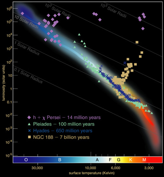
Figure 8
Really young clusters like the
Double Cluster h and chi Persei have high-mass O stars at the upper end
of the Main Sequence. Older clusters like the Pleiades have B stars
starting to age off the Main Sequence. The Hyades, even holder, is
starting to have A stars leave the Main Sequence, and the much older NGC
188 has F stars leaving the Main Sequence. This aging off the Main
Sequence is called the Main Sequence Turn-off, and we can use it to actually
tell how old clusters are. The oldest clusters in our galaxy are
about 14 billion years old, which is one way we know how old the Universe
is.