Welcome to Design Updates, a special section of the Affordable Housing Design Advisor. Each month this section will feature a short article - or "update" - with real-world examples of great design in affordable housing developments. Each update will illustrate where and how good design has made a real difference in creating affordable housing that works: for residents, for neighbors and for the community as a whole.

The purpose of the updates is to help all the stakeholders involved in community development learn more about the meaning and value of good design and, more importantly, to see how a commitment to good design can add value - not cost - to affordable housing developments. Each Update in the series is part of a broader initiative called the Campaign for Excellence in Affordable Housing Design.


RELATED DESIGN ADVISOR PAGES
  • Size and Rhythm of Openings
  • Visual Complexity
  • Individual Identity
  • Trim and Details
  • Materials and Color

    ADDITIONAL RESOURCES

  • DESIGN MATTERS contains a catalog of exemplary affordable housing developments throughout the U. S built between 1980 and 2000.

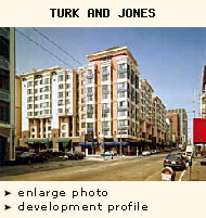
  • Update #17: Catching Your Eye: The Importance of Visual Complexity in Housing Design

    As you spend time in your community, which buildings catch your eye and interest you? Which do you find uninteresting? The last time you looked for a house or an apartment, how much of your decision was based on how the building 'felt' from the street - its curb appeal? The ones that you remember, the ones that had a lot of curb appeal, were probably the ones that were more interesting visually. In this Update we are going to look at several different approaches to creating visual complexity and see how thoughtful design can add visual interest - and appeal - to affordable housing developments.

     We are going to start with a large building, 201 Turk and 111 Jones in San Francisco, California. In many ways the façade of this building is very typical: a series of punched windows that are located in the same position from floor to floor and that basically line up across the elevation. But this façade is anything but monotonous and visually boring. There are different types of windows, different materials, different types of roof elements, even different awnings at street level, all of which add visual interest and complexity to the building. The result is a large but very lively building that is fun to look at and is a welcome addition to the streetscape.


     The next building takes a very different approach to produce visual complexity. Lorin Station is a Berkeley, California development that provides rental units to families with low incomes. The last building we looked at had many building elements and many different interrelations between them. This building is far more simple but still visually interesting. There are five distinctive building masses visible in this image. Each has the same material finish, each has the same roof type and the same corner and window trim. But the building mass recedes, projects, and turns a corner. And the windows are different sizes and shapes, and are placed in distinctly different locations across the wall.

    The result is a small building of remarkable visual interest - a building that looks like a fun place to live, and one that almost invites you to imagine what's going on inside. For instance, which volume do you think has the stairs in it? And what do you think happens behind the odd-shaped windows on the far left of the photo? Is that the living room? A living/dining area? It's hard to tell exactly, but what's clear is that the design team has thought a lot about what goes on inside the building and has created a façade that works inside and out.

     Visual interest is important for smaller buildings, too. Lyton Park Place is an affordable housing development for families with low to moderate incomes in St. Paul, Minnesota. The design team did a couple very simple things to improve the visual complexity of these units. First, they added special wood trim to the bay window gables in each unit. Then, to distinguish one unit from the other, they painted the main gable of one house white and added a small gable to the porch of the other house, over the front door. Simple moves, but imagine how different it would feel to live in this development if these houses were exactly the same. That's the difference design makes.

     West Town Cluster Housing in Chicago - a development for families, disabled adults and seniors with very low incomes - is another example of using very basic design techniques to create visual complexity. Here the design team took a large building and added significant visual interest by doing three simple things. First, they changed wall materials between the first and second floors. If this building had been either all brick or all stucco, it would have been much less interesting.

    Secondly, they added peaked roofs at various points along the building to break up the long expanse of the main roof. And, finally, they decided that the gutters should be dark so they contrast with the wall materials and introduce a series of vertical elements in a long, horizontal façade. These verticals also reinforce the placement of the gable roofs. Such a small decision - what color to make the gutters - and such a difference. Imagine if the gutters were the color of the stucco so you couldn't really see them against the upper floor of the building, and you can see how important such simple design moves can be. And this particular "move" didn't cost a thing - dark brown gutters cost the same as any other color.

    We are drawn to complex things. When we look for a house for ourselves, we are most often drawn to the ones that interest us when we walk up to them. That's curb appeal, something that is just as important for affordable housing developments as it is for market rate developments. Look at the design of your next development and ask how it reads from the street. Would you go back and look at it for yourself? If so, it's probably visually complex and interesting, and promises to be a lasting asset to the neighborhood.


    For photography credits see the Gallery section of the Design Advisor under "Photographers"