We have basically
covered the main issues one needs to know to understand how radio emission
is produced, how it is measured with modern instrumentation, and how that
instrumentation works. For the next three lectures we will look at
some of the science that has been and can be done using radio astronomy
techniques. We start with the Sun, since this object dominates the
radio sky, and offers a laboratory to investigate the main types of radio
phenomena at a high level of spatial and spectral detail.
Before launching into the
radio science itself, it will be helpful to look briefly at the structure
of the Sun. The Sun is a normal star of spectral type G2V, which
means that it is burning hydrogen in its core, as it has been doing for
the last 5 billion years, and as it will continue to do for about 5 billion
years more.
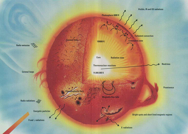
Figure 1: A schematic view of solar structure
The core temperature is about
14 million K, and the temperature falls off with distance from the core,
eventually reaching the surface temperature of 5800 K. The photons
generated in the core take about 1 million years to reach the surface,
since they propagate outward in a random walk with a very short mean free
path. Their point of last scattering is in the photosphere, after
which they are finally free to stream out into space. Because they
are in thermal equilibrium with the photosphere, they have a pure blackbody
spectrum corresponding to the 5800 K temperature, but en route to space
they encounter the more tenuous gas of the other layers of the solar atmosphere--the
temperature minimum region, the chromosphere and the corona--so the solar
spectrum shows many spectral lines. The fact that these
lines are mostly absorption lines tells us that the temperature
falls to yet lower values above the photosphere, to about 4500 K in the
temperature minimum region. This is fully expected, but what is surprising
is that above this height the temperature rises again, and in fact rises
very steeply at about 2000 km above the photosphere to form a very hot
(several million K), very tenuous plasma that we call the corona.
The figure below shows the temperature profile starting just below the
photosphere, through the temperature minimum region, the chromosphere,
and the abrupt increase leading to the corona.
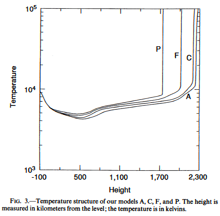
Figure 2: From Fontenla, Avrett & Loeser (1993)
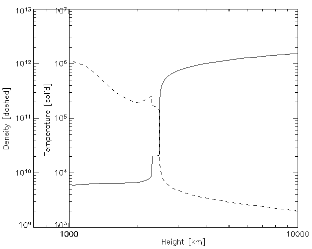
Figure 3: A similar plot to that of Figure 2, showing the temperature
and density
(for an older model showing the now discredited "Lyman α
Plateau").
The appearance of the "quiet
time" solar atmosphere at radio wavelengths is governed by the plasma parameters
(temperature, density, and magnetic field strength) and the radiation mechanisms
that generate the radio emission (free-free emission, gyroresonance emission,
and plasma emission). The following figure shows the height versus
frequency of three characteristic frequencies that we have already met--the
plasma frequency, the gyrofrequency, and the frequency at which free-free
emission reaches optical depth unity.
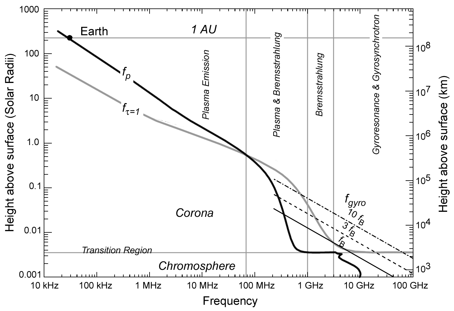
Figure 4: The highest curve in this plot specifies the type of emission
mechanism that will dominate at
different frequencies in the solar atmosphere. The curves are
based on the dependence of different
emission mechanisms on the plasma parameters of temperature, density,
and magnetic field strength.
The plot covers 7 orders of magnitude in frequency, and in height in
the solar atmosphere.
Here is an animation
showing the different appearance of the full Sun as a function of frequency.
In reality it is only a set of four images, taken at the highest available
resolution, with the images morphed from one image to another to give the
impression of a large set of frequencies.
Because of the huge
increase in electron density at the chromosphere, radio emission becomes
optically thick due to free-free emission at heights higher than the solar
minimum region, even at the highest frequencies. Therefore, radio
observations pertain only to the upper chromosphere and higher. Let
us start at the chromosphere and move outward in the solar atmosphere.
As Figure 4 shows, this is also equivalent to starting at the highest frequencies
and moving to lower frequencies. The figure below shows the Sun at
very high (sub-mm) frequency.
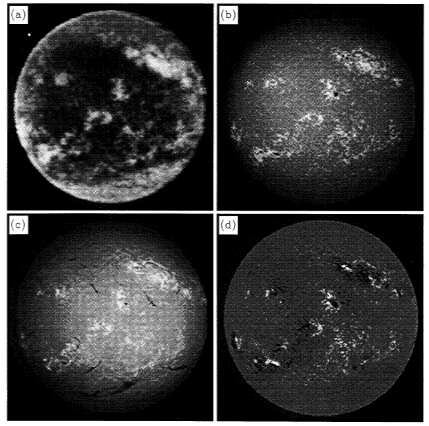
Figure 5: (a) The Sun at 850 microns wavelength (>300 GHz),
showing the low
contrast of features in the low chromosphere. The brightest features
have a
brightness temperature of about 6500 K, and the darkest features have
a brightness
temperature of about 5500 K. The other panels show (b)
Ca II, K-line image,
(c) H-alpha, and (d) a magnetogram, for comparison.
From Bastian, Ewell, & Zirin (1993).
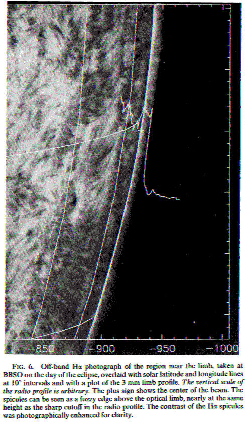
The figure below shows how
the height of the radio Sun at 3 mm wavelength extends well beyond the
visible edge (photosphere), and matches quite well with the tops of the
spicules.
This is from Belkora, Hurford, Gary and Woody (1992).
Recent work has called into
question the existence of a stationary temperature profile in the chromosphere,
such as those indicated in Figures 2 and 3. This idea is spurred
observationally by the fact that very cool regions of the atmosphere appear
to exist in which CO (carbon monoxide) lines are seen. It is also
suggested by time-dependent, dynamical models. Carlsson and Stein
(1995) give the following plot showing a time-averaged "chromosphere" and
the actual range of time-variable dynamical temperatures that went into
the average.
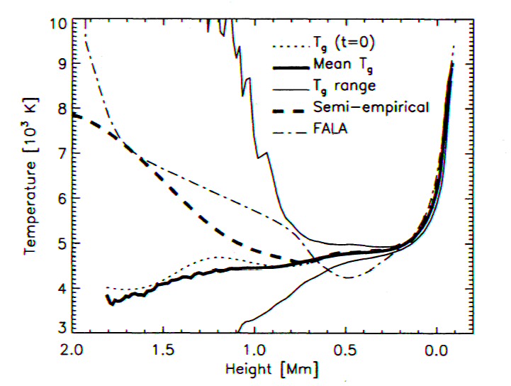
Figure 7: A comparison of the FAL model A with some temperature
profiles of the
lower solar atmosphere derived from time-dependent wave heating models
of the
chromosphere. The two thin solid curves show the extremes of
temperature, while
the thick line shows the time-averaged profile. The dot-dashed
line is the FAL A model.
The chromosphere is dominated
by the supergranular
structure--large-scale convective cells of order 30" (200,000 km) in
size. The gas rises in the center of the cells, moves to the edges,
and descends. As a result, it tends to sweep relatively weak magnetic
fields to the edges, where it collects to form the chromospheric
network structure. Radio images show a good correspondence
of the radio sources with the magnetic elements, as shown in Figure 8.
Quantitative results are frustrated by the fact that such images from the
VLA require an all-day (8-12 hour) synthesis, and so time-variability cannot
be easily followed. There is some evidence that the individual magnetic
elements "flicker" in brightness.
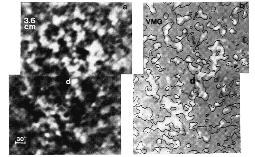
Figure 8: The panel on the left shows the radio image at 8.5 GHz (3.6
cm wavelength), showing the
network struction. The corresponding magnetogram on the right
shows a high degree of agreement,
with each source overlaying a magnetic element of the chromospheric
network. The feature marked
with a "d" is the only one representing a magnetic dipole.
One still unresolved puzzle
about the chromosphere is why at some frequencies (at least 10-100 GHz)
the polar coronal holes appear brighter than the rest of the quiet Sun.
There is some evidence that all coronal holes, even those not at the poles,
are brighter. This means that the temperature of the lower chromosphere
(that sampled by this range of frequencies) is greater at an equivalent
optical depth. Meanwhile, coronal holes are darker
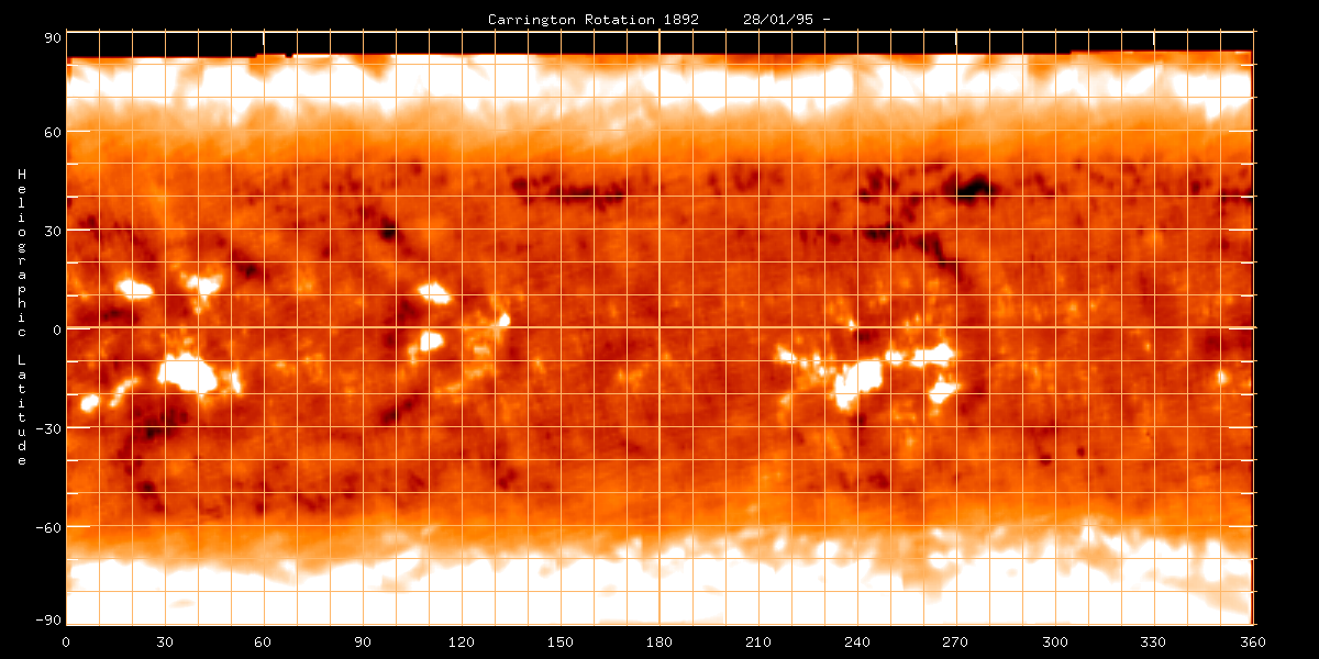
than the rest of the quiet Sun at lower frequencies. Here is a synoptic
chart showing this effect at 17 GHz, from Nobeyama. The contrast
in this image is enhanced, but the excess brightness is really only about
500-1000 K.
In addition to the ability
of radio emission to give the temperature of the chromosphere, it can also
tell us something about the magnetic field strength, derived from the magnetic
field dependence of the polarization. Recall that free-free emission
opacity was given in Lecture 3 as:
κν
= (1/3c)(2π/3)1/2(νp/ν)2[4πneΣ(niZi2)e4/me1/2(kT)3/2]Gff(T,ν)
= 9.78 x 10⁻³neΣ(niZi2)/ (ν2T3/2)
(1)
| x { |
18.2 + ln T3/2 −
ln ν (T
< 2 x 10⁵ K) |
| 24.5 + ln T −
ln ν
(T > 2 x 10⁵ K) |
However, this expression does
not include the effect of the magnetic field. That can be included
by changing the frequency from ν
to ν + σνB
|cos θ|, where
νB=
2.8x10⁶ B
is the electron gyrofrequency, θ
is the angle of B to the line
of sight, and σ is +1 for o-mode, and -1 for x-mode. The expression (1) then becomes:
κν=
9.78 x 10⁻³neΣ(niZi2)/[(ν
+ σνB |cos θ|)2T3/2]
(2)
| x { |
18.2 + ln T3/2 −
ln ν (T
< 2 x 10⁵ K) |
| 24.5 + ln T −
ln ν
(T > 2 x 10⁵ K) |
where we ignore the slight dependence
on νB in the logarithmic term. Recall that in order for free-free opacity
to be important relative to gyroresonance opacity, we must have ν
> sνB,
where s is typically 3 or 4,
otherwise gyroresonance opacity will dominate.
When we observe the chromosphere
in the two senses of circular polarization (R and L), the expression is
the same as (2), but without the absolute value on the cos θ
term. In other words, a given mode (i.e. x-mode), can correspond
to either R or L polarization, depending on the sign of B.
Now, recall that for optically
thin emission,
Tb = Teτ
= TκL.
We can express the degree of
polarization as
P = (TR−TL)/(TR
+ TL) = (κR−κL)/(κR
+ κL)
= (2νB/ν)cosθ.
(3)
Thus, the degree of polarization
is directly proportional to longitudinal (line-of-sight) component of magnetic
field strength,
Bl
= B cos θ.
This gives a means to measure relatively weak magnetic fields in the chromosphere.
Unfortunately, there is one more complication, because in fact the chromosphere
is not optically thin. One might expect, then, that this would eliminate
any net polarization, but note that the two modes become optically thick
at different depths. This is shown in Figure 10, which is just a repeat of Figure 2 with an overlay that shows how, with no magnetic field, a particular frequency may become optically thick at the height indicated by the dashed black arrow.
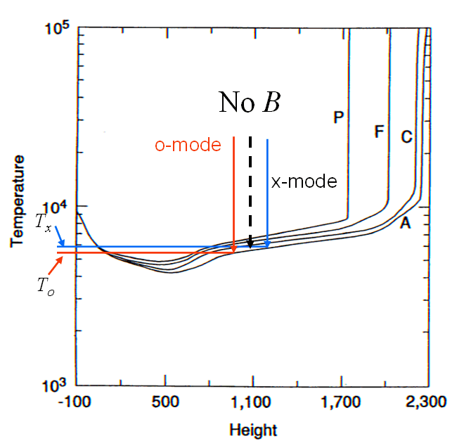
Figure 10: Repeat of Figure 2, schematically showing how different opacities in o- and x-mode give rise
to different brightness temperatures and hence gives a net polarization. As Bl increases, the red and blue
arrows separate and the temperature difference increases, increasing the net polarization.
In the presence of a magnetic field, the greater opacity in x-mode (blue arrow) means it becomes
optically thick higher in the chromosphere than the o-mode (red arrow). Due to
the temperature gradient in the chromosphere, the brightness temperature
of the two modes is different (x-mode has a higher brightness temperature as shown by the blue and red horizontal lines in the figure),
so there is still a net polarization. Now, however, the polarization
is due to the mode-dependence of the brightness temperature due to the
temperature gradient, so we need a way to get the otherwise unknown temperature
gradient. Luckily, if we have the brightness temperature measured
at many frequencies one can use the slope of the radio spectrum, which
itself is related to the temperature gradient. In fact, if the brightness
temperature spectral index is written as n,
then the expression (3) becomes
P = (nνB/ν) cos
θ,
(4)
which is a general expression
since for an isothermal plasma the optically thin spectral index is n
= 2, for which (4) reduces to (3). Can
we really measure magnetic fields in this way? We do not really know
at present, because we have not had an instrument capable of the required
observations. We need excellent imaging to map the complicated structures
of Figure 8, but we also need the images at many closely spaced frequencies
to determine the spectral index. That is one motivation for building
the Frequency Agile Solar Radiotelescope (FASR), which for the first time
will have the required combination of imaging and spectral capability.
As we go higher
in the solar atmosphere, the temperature rises steeply to millions of K,
while the electron density falls greatly. This hot, tenuous plasma
was first discovered through radio observations, was quite unexpected,
and still remains unexplained. There have been many theories to try
to explain it, such as wave energy coming from the surface and being deposited
in the corona, but none of these theories seem to work. A favored
mechanism now is dissipation of magnetic energy through many small flares
(microflares), but current estimates show that there is not enough energy
released in the visible events to account for the hot corona. There
remains the possibility that even smaller events (nanoflares) might supply
the needed energy, but so far they have not been shown to rise steeply
enough in numbers to account for the needed energy.
The corona is everywhere
hot, but certainly is hottest in active regions, which are regions associated
with sunspots. Here we see that microflares and larger flaring events
tend to concentrate, and it shows that flares are closely related to magnetic
fields, that get stressed due to motions and new flux emergence to provide
energy for the sudden releases that we call a flare. However, many
aspects of this release of energy are still unknown. We will discuss
flares and solar activity in the next lecture. For now, let's look
at the general structure of active regions.