|
|
|
Materials and Color
Creative use of materials and color can add variety and visual interest to any façade. In general consider materials and colors - for the façade (including foundation walls) and for the roof - that are compatible with those in similar, good quality buildings in the surrounding neighborhood or region. Avoid introducing drastically different colors and materials than those of the surrounding area. Consider using materials and construction details that do not require repeated or expensive maintenance. Favor materials that residents can easily maintain themselves. Consider using materials with high levels of recycled content where possible.
 |  |
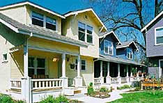
The colors used in these Sacramento homes are bold but not out of character with homes in the surrounding traditional neighborhood.
(Southside Park Co-housing)
|
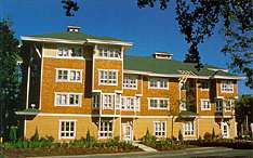
Calculated changes in colors and materials help define a base, middle and top for this Redmond, Washington building, helping to break down the overall scale and perceived size of the building so that it fits in better with its surroundings.
(YWCA Family Village)
|
 |  |
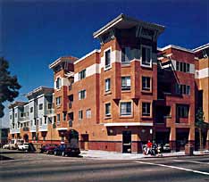
Bands of color and variations in cladding materials add variety and visual interest to this Oakland, California development. Note how the base of the building supports and ties together what look like two different "buildings;" one clad with stucco, one with horizontal siding.
(Hismen Hin-nu)
|
A band of color clearly defines the entrance level - pedestrian and vehicular - for this San Jose mixed-use development. Note how the color chosen matches that of the roof material and how the whole color palate is compatible with the Mission Revival architecture common in the southwest.
(YWCA Villa Nueva)
|
 |  |
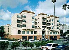
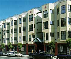
Color differentiates the public, street-level façade from the private units on the upper floors of this San Francisco apartment building. Note how the small square medallions at the top of the two central bay window shafts reinforce the front entrance and echo the color of the base of the building.
(555 Ellis Street)
|
Subtle changes in color and materials enliven the facades in this Seattle courtyard.
(Cascade Court Apartments)
|
 |  |
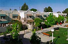
Different colored awnings are a simple way to differentiate separate two-unit clusters - each with a shared entry - in this Los Angeles courtyard housing.
(Willowbrook Green Apartments)
|
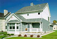
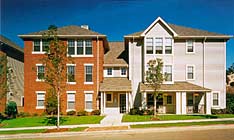
Basic colors, common to the surrounding neighborhood, are combined in unique ways to enliven the façade of this St. Paul, Minnesota home.
(Lyton Park Place)
|
 |  |
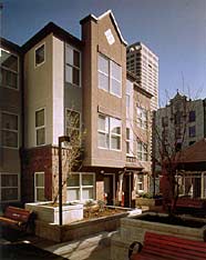
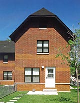
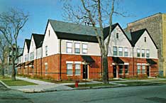
Bands of different colored brick help enliven the façades of this Chicago townhouse infill development. Note how they help strengthen the horizontal lines of the base of the upper floor windows and the tops of those on the first floor. A strip of concrete, plus another band of alternate colored brick, helps define the base of the building. Carrying the bands around corners helps visually unify the whole complex.
(West Town II)
|
Changes in color and materials visually separate the top and bottom floors of - and add visual interest to - this otherwise long and basically flat façade. Thick lintels over the windows and doors provide additional scale, as does the single line of dark, glazed brick near the base.
(West Town Cluster Housing)
|
 |
Using two different façade materials helps break a large building into two smaller ones, each of which is clad in a material compatible with houses in surrounding neighborhoods.
(Crawford Square)
|
|
|
|
|
