|
Entries
Provide as many private, ground level entries to individual units as possible. Ensure that all building entries are prominent and visible and create a sense that the user is transitioning from a public to a semi-private area. Avoid side entries and those that are not visually defined. At all entries consider issues of shelter, security, lighting, durability, and identity. For apartment buildings, allow visual access from manager's office and/or 24 hour desk. Allow visual access to stairs and elevators from the lobby. For buildings with clustered and individual unit entries, consider providing small "porch" areas that residents can personalize with plants, seasonal decorations, etc. Limit "shared entries" to the smallest number of households possible, eight maximum. Consider providing some form of storage - for strollers, bikes, shopping carts, etc. - at or close to all main entries.
 |  |
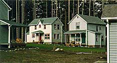
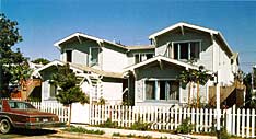
Porches are a simple way to define entries and provide a transition from public to semi-private areas.
(OPAL Commons)
|
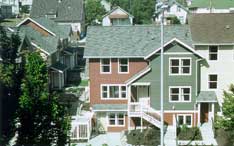
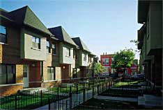
Each of the entries to these Tacoma, Washington townhouses is protected by its own small roof overhang.
(Matsusaka Townhomes)
|
 |  |
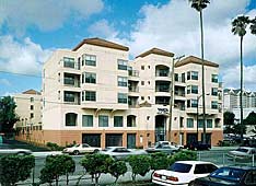
The main entry to this large building has been made prominent, visible and welcoming through a number of simple design strategies: it is centrally located; it "pops out" relatively to the rest of the façade; and it is double height.
(YWCA Villa Nueva)
|
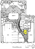
The manager's office for this San Francisco apartment building (highlighted) is located so that it faces the main entrance, allowing for direct surveillance.
(555 Ellis Street)
|
 |  |
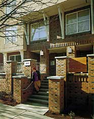
Prominent brick piers projecting out to the sidewalk give strong definition to the entrance to this Seattle housing. Note that the entrance itself is well lit and protected from the elements by a deep overhang.
(Cascade Court Apartments)
|
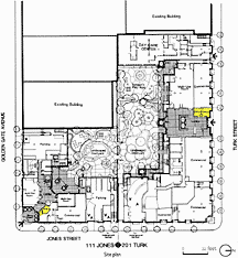
Manager's offices (highlighted) are placed directly adjacent to both entries in this large San Francisco complex.
(201 Turk and 111 Jones)
|
 |  |
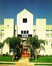
A slight setback, a pop-up roof, a large glass door and strategic landscaping all contribute to creating a dramatic entry to this Los Angeles apartment complex.
(Yorkshire Terrace)
|
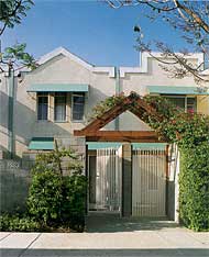
Entrances to two-unit clusters in this Los Angeles development are clearly defined by large arches which will eventually be covered in vines. The entries provide a clear transition between the public courtyard they face and the semi-private patios behind each gate. The patios also provide secure space for storing bikes, strollers, etc.
(Willowbrook Green Apartments)
|
 |  |
The basic shape of the building, combined with the simple arch in the fence, indicate clearly where entrance of this Santa Monica project is located.
(Ocean Park Co-op)
|
Simple setbacks and modest overhangs create elegant, clearly defined entries - which are also protected from the elements - for these Chicago townhouses.
(West Town II)
|
 |  |
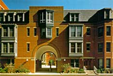
A monumental entry to this Boston complex helps break down the scale of the development as a whole and, at the same time, projects an open, welcoming image to the surrounding community.
(Langham Court)
|
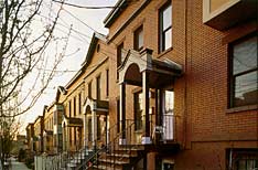
Small, but elegantly designed, roofs provide shelter at the entries to these Albany, New York townhouses. Note how the design echoes the basic shape and detailing of the main roof of the building.
(Catherine Street)
|
|
|
